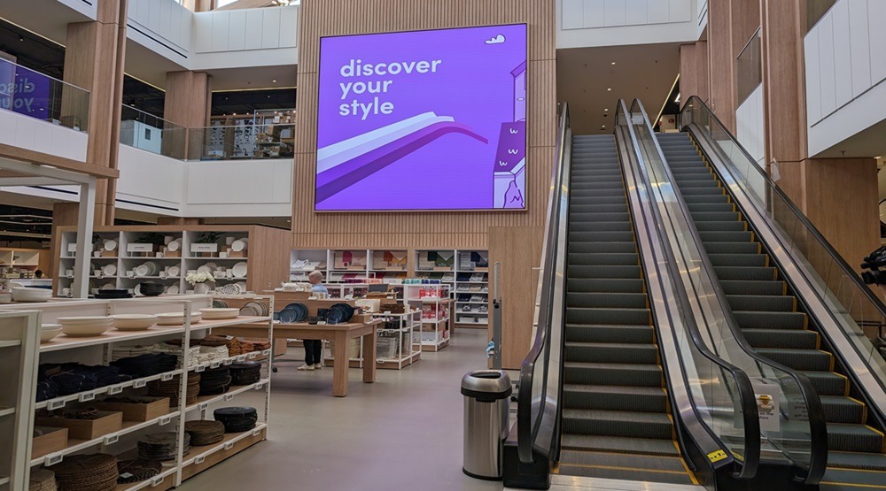
WILMETTE, Ill. – E-commerce furniture and décor giant Wayfair is set to cement itself in the brick-and-mortar world when its first major store opens near Chicago next week.
At 150,000 square feet and spanning two floors, the store aims to be a stop for all things home, including furniture, décor, houseware, lighting, rugs, outdoor products, faucets, showerheads and much more.
The store features a racetrack layout on both floors. It’s organized by rooms of the home, which are organized further onto themselves by styles, such as modern, coastal and traditional. In certain sections, items are divided even further, such as by color. In pillows and wall art, for example, which are located next to each other, warm pillow tones would be close to warm color art. Some items, like rugs, are organized by color first, as the company says that’s the main way people shop the category.

Everything is meant to feel fast and easy, executives said. If a customer knows exactly what they want in living room, for example, a direct path can be taken to get there and then to check-out. There are “intentional adjacencies,” however.
“If you’re updating a bathroom with a new toilet or tub, for instance, you’ll also find cash and carry towels nearby,” said Liza Lefkowski, vice president of merchandising, propriety brands and stores.
To that end, items are placed as cohesively as possible. A pillow rack is located next to a few sofas, allowing customers to test out looks. Vases, likewise, can be tested out on nearby coffee tables.
“Customers often don’t have much confidence in putting a whole look together, but they know what they want when they see it,” said Lefkowski. “We want to make it as easy for them as possible.”

On the store’s ground floor, the company opted to feature categories and items commonly found on the first floor of the average home, with a few exceptions. Living, dining and home office furniture can be found on the first floor, while bedroom, bedding and baby furniture can be found on the second.

The second floor also includes more miscellaneous items like lighting, outdoor, housewares and appliances, as well as a dedicated home improvement and kitchen space. This floor is divided more by brand, particularly in appliances and plumbing, with more recognizable brand names having more of a focus. One exception is outdoor, which is divided by material type – again, the main way the company says customers shop the category.
Several “studio” sections are featured throughout. On the first floor in the rug department, design professionals will give customers recommendations and help them see what furniture and décor will look like in their homes through a room planner. On the second floor, a home improvement studio allows customers to test out looks and compare tile samples with cabinetry.

Finally, a mattress “Dream Center” is laid out in a way that allows customers to find their preferred mattress style and firmness. They then can grab pillows, duvets and other items to test everything out together.
Customers have three ways to buy items: grab and go (or cash and carry), same-day pickup and free delivery. Cash and carry will mainly apply to smaller items, such as housewares and décor, but it can apply to furniture if the customer has the space in their vehicle to take it home. The general rule is that if it can fit in a customer’s car, they can take it. For delivered items, the company stressed that shipment will be quick, sometimes in just two days.

Items shown in the store will cover the complete style spectrum, with “every home” being able to find something suitable across all price ranges, executives said.
“We’re showing lots of product and lots of range, but we have tried to make it approachable to not let people feel overwhelmed,” said Barclay Resler, head of visual merchandising. “Our goal was to have the offering of a big box but with residential touches.”
The strategy
The company isn’t starting without any brick-and-mortar experience. It currently operates eight small-format, more-curated stores across its three specialty brands.
“We’ve been around since 2002 and have always taken the long-term approach,” Lefkowski said. “We always knew we wanted a physical store. We’ve done the hard work already. We’re a known brand with name recognition. We have a big logistics network.

“We don’t have specific plans for a second store yet, as we intend to learn from our experience with this store. We designed it with repeatability in mind, but we expect we will need to improve in some areas.”
The hope is for the e-commerce site and physical store to strengthen each other.
“Obviously, you’re able to do more in a physical space,” she said. “People can touch and interact with furniture. We can be more creative with displays. We think having a store will help bring our brand to life and strengthen it as a whole.
“It’s additive,” Lefkowski continued. “Our goal is really to give people a choice on how they want to shop.”
Why Chicago?

“It’s a fantastic market,” Lefkowski said. “Wilmette is a vibrant suburb with lots of young families. It’s also practical. We needed a large space, and we found one in Edens Plaza. We had a great development partner. We also have a nearby fulfillment center and a great billboard right on I-94.”
Wayfair’s store opens May 23 in Wilmette, Ill.
