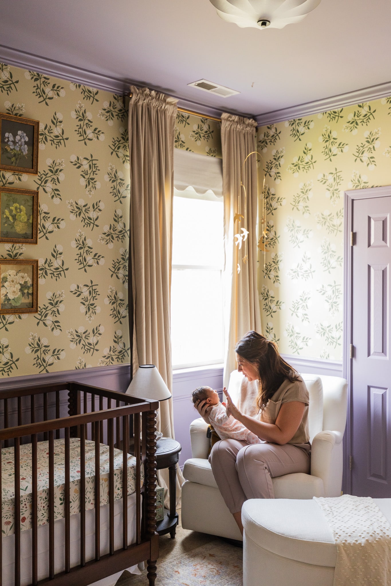
Last fall, I started designing a nursery for my sister’s newest addition. Her baby arrived early (on January 1st!) and over the last month, Chris and I have been on location finishing it up just in time for her to move out of her bassinet and into her crib and brand new nursery. Today, I am so excited to share Gigi’s nursery. She’s still so tiny, but it’s incredible how this nursery just feels like her room. It’s Gigi’s room. (And I think she likes it!)
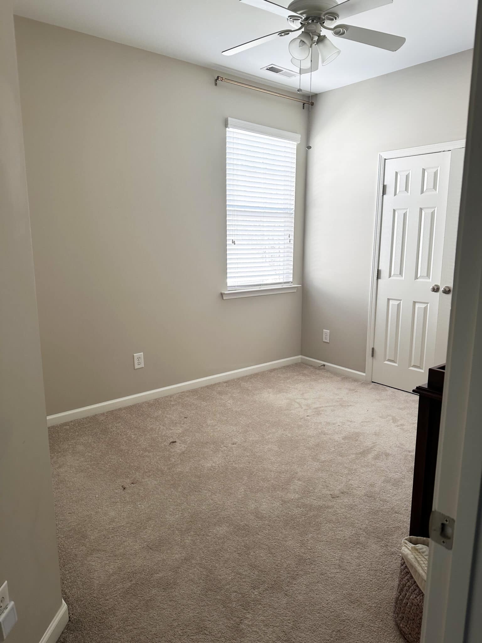
(Where we started! *shock!*)
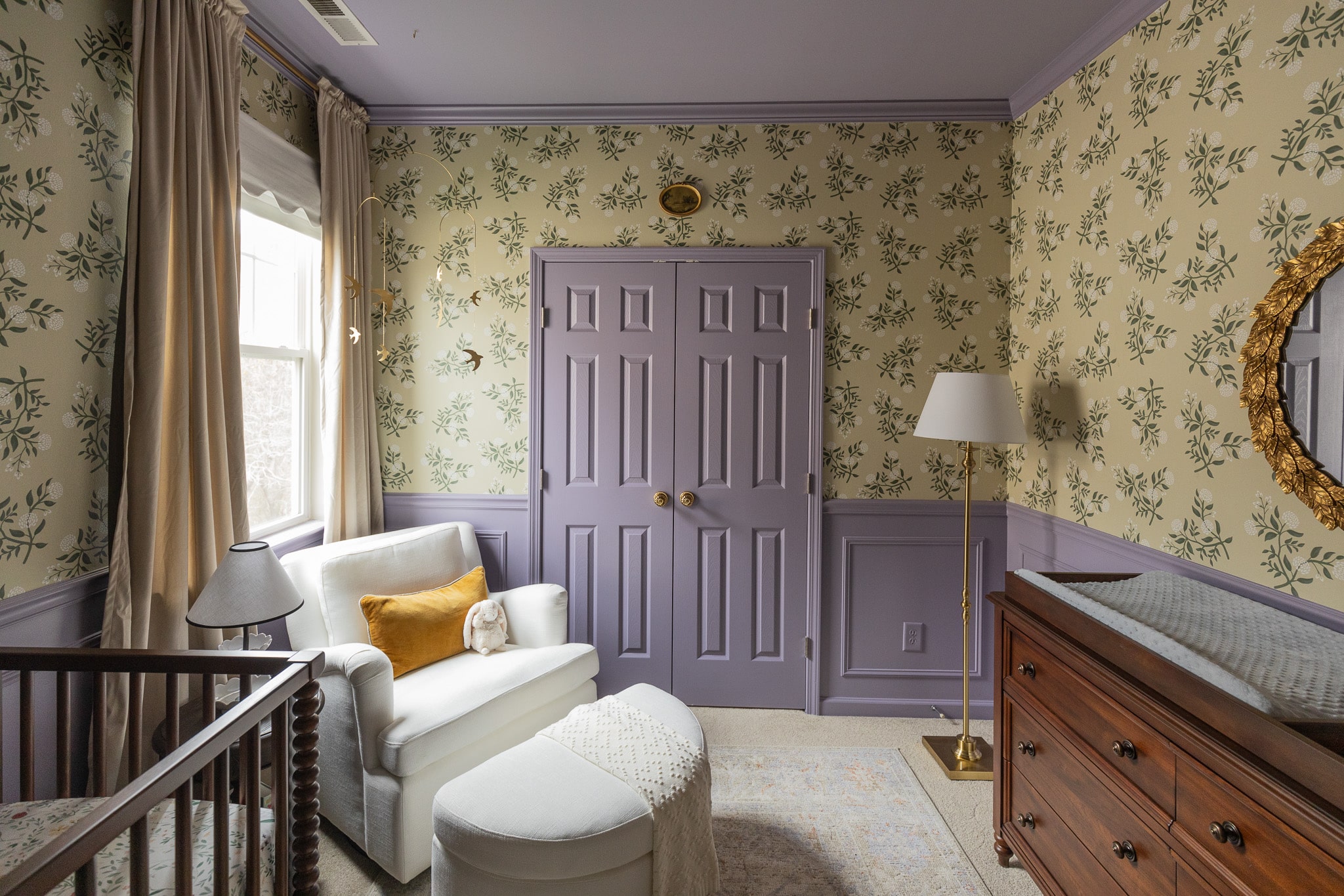
When planning this nursery with Andi, I actually took inspiration from the baby shower invites I created last December. They had a creamy-yellow background with purple birds on it. “I love these colors so much,” is what Andi told me. “These colors are what I want for Gigi.” I knew I wanted to work with that complementary color scheme with the warm yellowy cream and purple.

I also took inspiration from the size of the room. It’s a small room. In fact, Andi and her husband have talked repeatedly about expanding the room into the closet, so that might happen in the future. But nurseries don’t have to be big! Actually they’re so wonderful small, in a lot of ways.
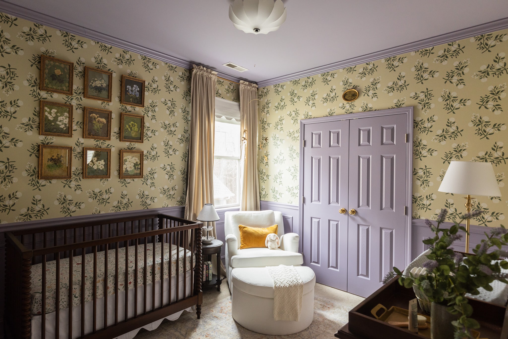
Shop Gigi’s Nursery
The Wallpaper
I knew that I wanted the room to feel peaceful and serene while also being interesting. And my favorite way to do that in a small space is with wallpaper. So, that’s where I started.
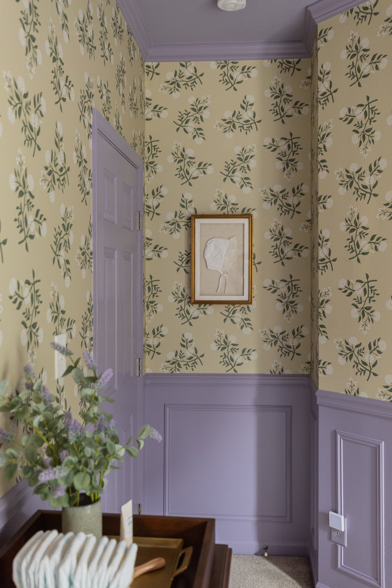
North & Finch Blossoms Wallpaper | Shadowbox Frame
Initially I was looking for a purple wallpaper, but very quickly realized I wanted to go warmer. So I decided to go creamy yellow for the wallpaper and bring in the purple with paint. Once I found the wallpaper it kind of all came together.
A lot of times, we can try to put a lot of things in a small space like furniture or art. With the right wallpaper on all the walls, it adds interest without all the stuff. And it doesn’t feel empty or unfinished! But, surprisingly feels very serene because you’re just encompassed with a beautiful pattern and not a ton of extras.
The Trim

Above, is the room at the beginning of February before we started anything. The very first thing we did was install box trim that made the room feel 10x more charming and 5x larger, somehow. Since the baseboards are a little shorter, we didn’t go super thick on the crown or wall trim. So we chose some pretty minimal trim pieces. The crown is a simple 3″ tall trim to match the baseboard.
We hung the chair rail 36″ above the ground and not so chunky that it would overwhelm the box trim underneath it, which was just a simple all-purpose wall trim.
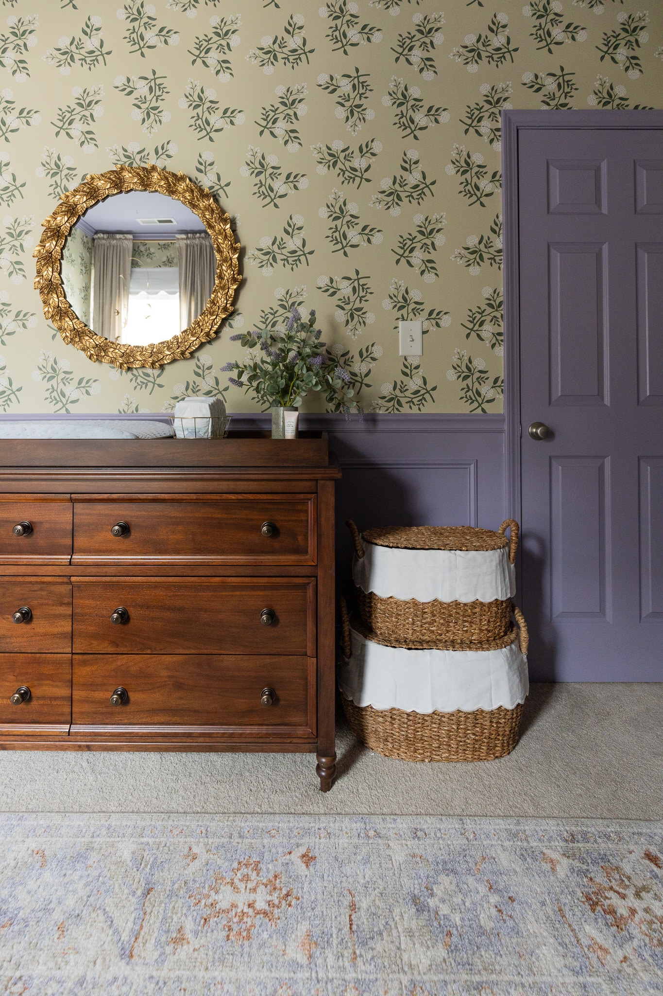
Round Mirror | Dresser & Topper | Scalloped Lined Baskets
The Paint
I was really inspired by going to the Princess Diana display in Las Vegas last month. The colors the curators chose for the walls were so clean without toning them down. In the past, I think we (including me) have gone to a very muddy version of a color in our homes. But I think we’re going to be seeing cleaner colors in design. That inspired me to choose the red paint color for the mudroom. I think the blue paint color in the bonus room is a clean blue — it’s not super toned down. I felt really inspired to not be shy in the color that I chose. It doesn’t have to be vibrant to be clean.
After looking at several samples on the wall, I ended up painting the room Ash Violet, a Sherwin-Williams color. I didn’t want the paint color to feel too neutral of a purple, because I think it could have gone really dull in a neutral next to the neutral wallpaper color.
The violet is a really sweet lavender, but it has gray tones in it so at night it feels very calm. And then under bright sun it’s a little bit more lively. It feels refreshing.
The Curtains
The curtains were something that I struggled with even through last week. They were a lesson to me on trusting my vision. I didn’t want the curtains to steal any thunder. Initially I had purple curtains picked out, but I thought, “Ugh, that might feel too demanding.” And then I selected white curtains, but was that going to allow the cute scalloped roman shade to shine?
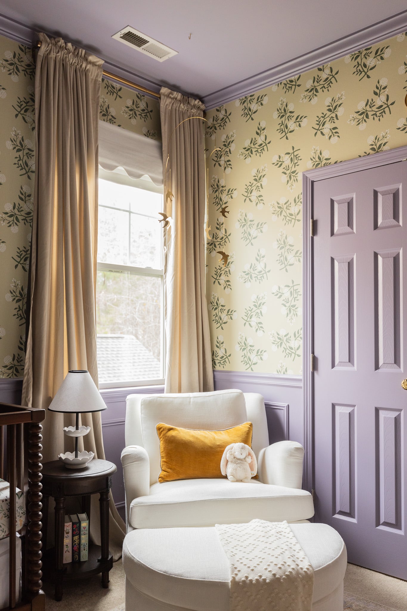
Velvet Curtains | Brass Curtain Rod | Glider | Pillow | Side Table | Lamp | Blanket | Books
Finally, I picked out these curtains that are a beigy-blush. When I brought them to the house, I thought, “This doesn’t go with anything. Why did I choose this color?” It wasn’t until after we hung the art prints that had this beigy color in it that the curtains made so much sense. They’re almost tone-on-tone against the wallpaper, so they can allow other things to shine. And they were so budget-friendly.
The Art
I would say Andi’s style is very vintage traditional. She loves art, so I knew I wanted to add something to the walls without overwhelming the whole room. Their home has a very “collected” feel wherever you look. And that was something we wanted to bring to this room, as well.
The prints were such a show-stopper in the room. Anytime that you have the opportunity to do a gallery wall, try a 9-frame gallery. That’s my favorite number for a gallery wall. A symmetrical gallery wall is so stunning; and the power of 3s is really impactful.
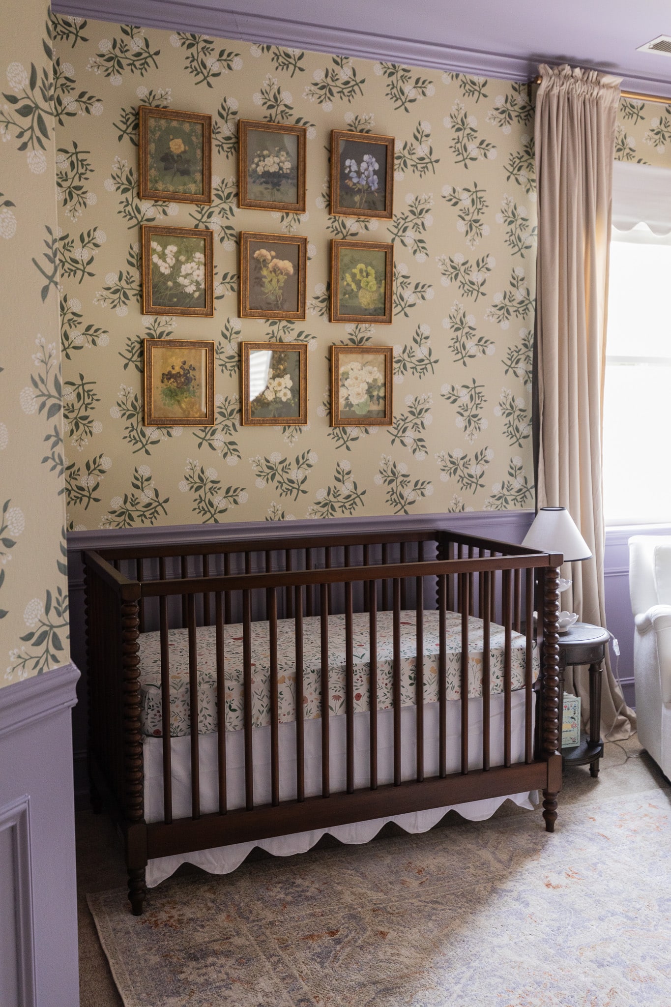
Distressed Gold Frame | Crib | Mattress Sheet | Crib Skirt
I held onto a beautiful calendar by Carleigh Courey from last year and used that for the gallery wall prints. (Here’s how I did it.) I think the colors play really well with the wallpaper. Floral on floral can do no wrong. You can do this with any beautiful calendar!
The Doorknobs
When I asked Andi what her favorite part was (before I hung the mobile), it was the doorknobs that we switched out on the closet. She said, “These feel so special to me.”
Switching the doorknobs was so easy. We did not swap out the hinges on the door, and that is something you can do for a bonus point. But don’t feel like “I can’t switch out my doorknobs because then I’m going to have to switch out the hinges too.” That gets people stuck, and they won’t do anything. So if you want to switch out your doorknobs, do it! You can always switch out the hinges at a later time if you really want to.
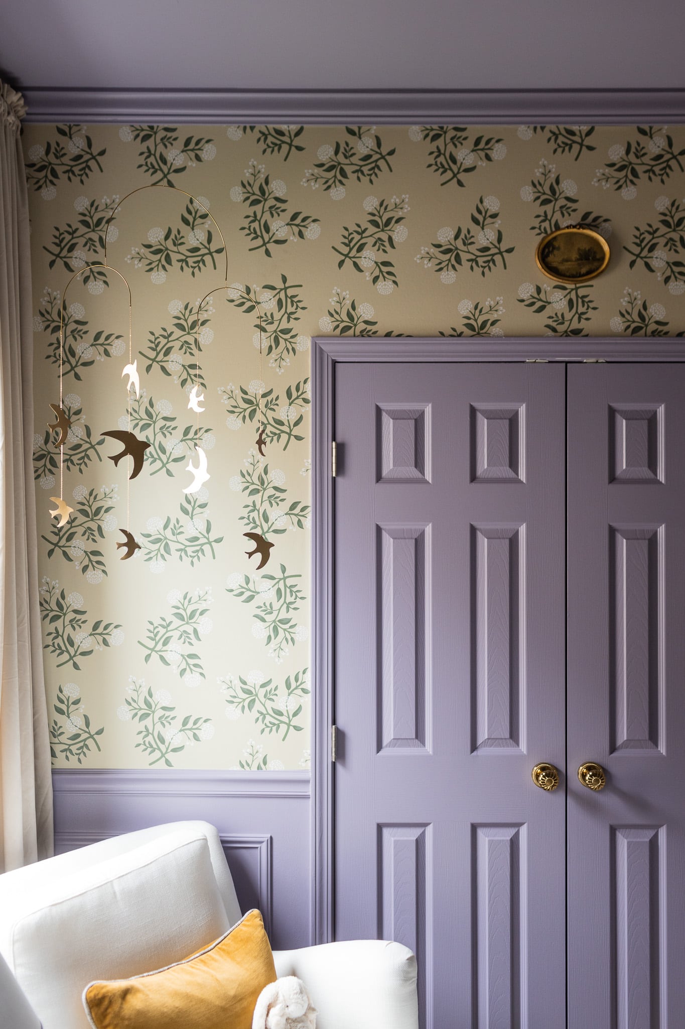
The Mobile
As soon as we hung the bird mobile, the room came together. But there was a little trial and error on placement. We tried it over the changing table. We tried it over the crib. Neither felt quite right. And then as soon as we put it over the chair, it just felt like that was exactly the thing that the corner needed. A little something blingy. The mobile plays off the light coming through the window. Also when you’re feeding a baby, sometimes you need something to keep them awake a bit more. It gives a baby something to look at. I just love the idea of a mobile over a glider — it’s expanded my mind!
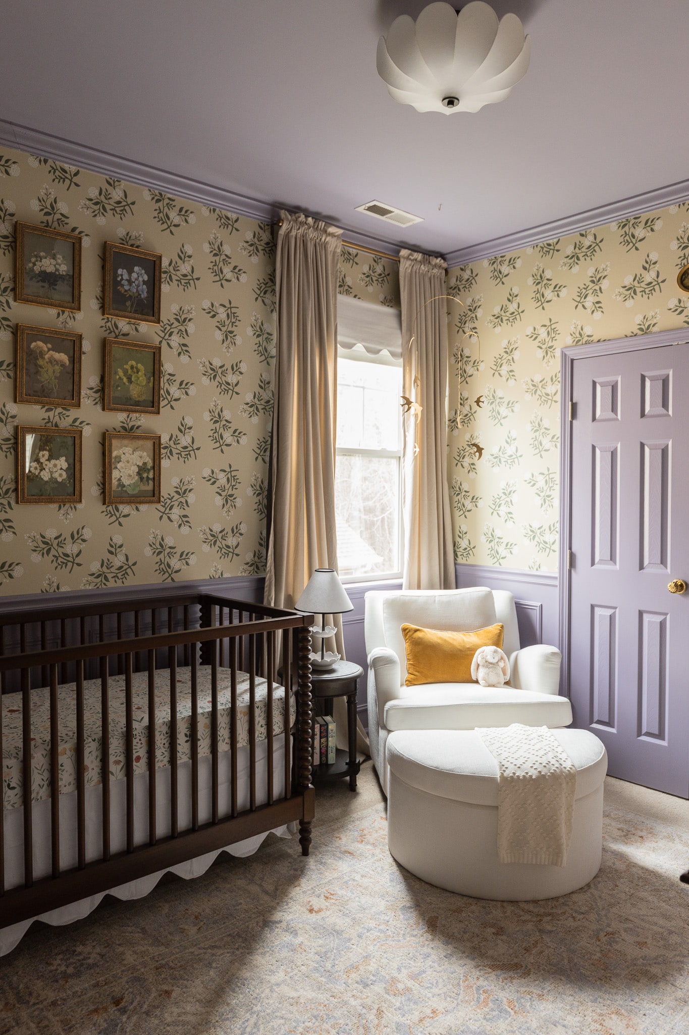
Brass Bird Mobile | Light Fixture | CLJ x Loloi Oatmeal/Lavender Rug
All in all, this room has been such a fun project and so special for me to share with my sister Andi. What a dream to see the heirloom-worthy crib we designed with Pottery Barn in the room! It was the best compliment when Andi sent me a text afterward the space was finished that said, “I feel so calm. It’s the most beautiful sanctuary.” I can’t wait to see baby Gigi grow up here — but not too fast!
Shop All Sources
Wallpaper
Light Fixture
CLJ x Loloi Oatmeal/Lavender Rug
Turned Wood Crib
Scalloped Crib Skirt
Crib Sheet
Botanical Calendar Art Prints
Vintage Brass Frames
Shadowbox Frame
Dresser & Topper
Round Gold Mirror
Scalloped Lined Baskets (set of 3)
Floor Lamp
Gold Doorknobs
Glider Swivel Chair
Cream Blanket
Velvet Liza Pillow
Brass Bird Mobile
Beige Velvet Curtains
Brass Curtain Rod
Scalloped Blackout Shade
Round Wood Side Table
Table Lamp
Rifle Paper Co. Classic Books


I don’t think the title of your article matches the content lol. Just kidding, mainly because I had some doubts after reading the article.